


Vlad Yudkin
January 29, 2024
The Power of Responsive Mobile Design
In an era dominated by smartphones and tablets, creating a seamless and engaging user experience across various devices is paramount. Responsive mobile design has emerged as a solution to this challenge, ensuring that websites and applications adapt effortlessly to different screen sizes and resolutions. In this article, we'll explore what responsive mobile design is, its uses, and the myriad benefits it brings to the digital landscape.
What is Responsive Mobile Design?
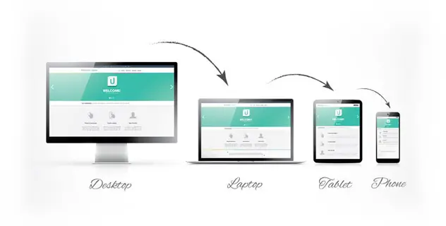
Responsive mobile design refers to the approach of designing and developing websites and applications to provide an optimal viewing and interaction experience across a wide range of devices, from desktop computers and laptops to tablets and smartphones. The key principle behind responsive design is to create a flexible layout that adapts to the user's device, ensuring content remains easily accessible and readable.

Uses of Responsive Mobile Design
- Cross-Device Compatibility. One of the primary uses of responsive mobile design is to ensure cross-device compatibility. With users accessing content from various devices, responsive design allows a seamless transition between different screen sizes and resolutions.
- Improved User Experience. Responsive mobile design is focused on enhancing the user experience by providing a consistent and user-friendly interface. When users can access and navigate a website or application effortlessly, they are more likely to stay engaged and satisfied.
- Cost-Effective Development. Instead of developing separate versions of a website or application for different devices, responsive design allows developers to create a single, adaptable version. This approach is not only more cost-effective but also streamlines maintenance efforts.
- Search Engine Optimization (SEO). Search engines, such as Google, favor responsive websites when determining search rankings. A mobile-friendly design is a crucial factor in SEO, as it ensures that users can access and interact with content easily on mobile devices.
Benefits of Responsive Mobile Design
- Increased Reach. With the proliferation of mobile devices, a responsive design ensures that your content reaches a broader audience. Whether users access your site from a smartphone, tablet, or desktop, they can enjoy a consistent and optimized experience.
- Time and Cost Efficiency. Responsive design streamlines the development process by eliminating the need for separate designs for different devices. This not only saves time but also reduces costs associated with maintaining multiple versions of a website or application.
- Enhanced User Engagement. A positive user experience leads to increased engagement. Responsive design ensures that users can quickly and intuitively interact with your content, leading to longer visit durations and a higher likelihood of conversions.
- Adaptability to Future Devices. As new devices with varying screen sizes and resolutions emerge, responsive design provides a future-proof solution. Your website or application can adapt to the changing technological landscape without requiring extensive redevelopment.
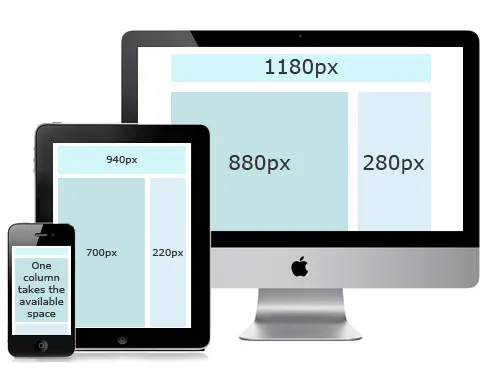
Types of Responsive Layout
Responsive layout is a critical aspect of web design, ensuring that websites adapt to different screen sizes and devices. There are several types of responsive layouts, each catering to specific design and user experience needs. Here are some common types:
Fluid or Liquid Layouts
Fluid layouts use percentages for widths instead of fixed pixel values. Elements on the page expand or contract relative to the screen size. This type of layout allows for a more flexible and fluid design, accommodating various screen sizes seamlessly.
Fixed Layouts
Fixed layouts have a set width, usually specified in pixels. The content does not change based on the screen size, which can lead to a less optimal experience on smaller screens. While less adaptable than fluid layouts, fixed layouts can be beneficial for certain designs that require precise control over the page elements.
Adaptive Layouts
Adaptive layouts involve creating numerous fixed layout designs for different screen sizes or devices. The website then detects the user's device and loads the appropriate layout. This approach allows for more control over the design on specific devices, but may require more effort to maintain multiple layouts.
Elastic Layouts
Elastic layouts use relative units such as ems for widths, making them somewhat similar to fluid layouts. However, ems are based on the font size, making the layout more adaptable to changes in text size. Elastic layouts offer a compromise between fixed and fluid layouts, providing flexibility while maintaining some level of control.
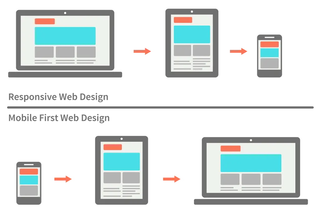
Mobile-First Layouts
The mobile-first approach involves designing for mobile devices first and then progressively enhancing the layout for larger screens. This strategy ensures a streamlined experience on smaller screens and often results in more efficient and optimized designs.
Responsive Grid Layouts
Responsive grids divide the layout into a grid system, and each element occupies a specific number of grid units. The grid adapts to different screen sizes, ensuring a consistent structure. Popular grid systems like Bootstrap and Foundation facilitate the implementation of responsive grid layouts.
Choosing the right type of responsive layout depends on the specific requirements of a project, the content structure, and the desired user experience across different devices. Web designers often combine these layout types or use a combination of frameworks and tools to achieve the best results for their projects.
Conclusion
In the dynamic digital landscape, responsive mobile design has become a cornerstone of successful web development. Its ability to provide a consistent and optimized user experience across diverse devices not only meets the current demands of users but also prepares websites and applications for the challenges of tomorrow. Embracing responsive mobile design is not just a trend; it's a strategic decision to stay relevant and competitive in the ever-evolving world of technology. We can fully adapt your website for different devices
Sources:
Responsive Web Design: What It Is And How To Use It
Responsive Web Design Basics
Types of Responsive Layouts
The Fundamentals of Responsive Website Design
The Different Types of Responsive Design