


2.3s
Website
load time
7+
Easy ways
to get in touch
Services We Delivered
Full Website Rebuild and
Design improvements
SEO Cleanup
Online Reputation
Management
Rank & Traffic
Monitoring
Content &
On-page SEO
SEO
Link
Building


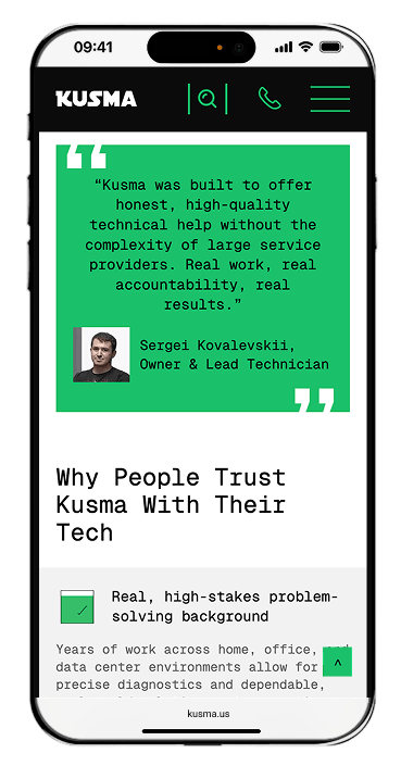
About the Client
Kusma is a local owner-led IT business in Miami serving both home users and business clients. The company helps with everything from computer repair and tech support to managed IT services, infrastructure, backup, networking, and related business IT needs.
Because the business works across two different audiences, the website needed to explain the offer clearly, feel trustworthy, and make it easy for people to take the next step.
Industry
IT services
(B2C and B2B)
Service area
United States (Miami)
Timeline
8 weeks from
strategy to launch

THE CHALLENGE
Kusma works with both home users and business clients, but the old website did not make that distinction clear. Different audiences were seeing the same pages, the service offering felt overloaded, and visitors had to do too much work to understand where to go.
The result was a website that felt harder to navigate, less trustworthy, and less effective as a tool for turning visitors into inquiries.
What was not working
- No clear separation between residential and business audiences
- A broad list of services with no clear hierarchy
- An outdated presentation that weakened trust
- No fast or obvious path to contact
- Weak structure for search visibility
- Difficult content management on the back end
Goals & Challenges
This project was not just about making the site look better. The goal was to create a website that feels clear, trustworthy, and easy to use from the very first seconds.
The new site needed to help visitors quickly understand what Kusma offers, which direction is relevant to them, and how to get in touch without confusion.


Separate home and business audiences clearly

Turn a broad offer into a simpler structure

Strengthen trust in the brand

Make the contact journey faster and easier

Build a flexible page system for future growth

Create a stronger SEO foundation from day one
Our Approach
 Two directions, clear from the first screen
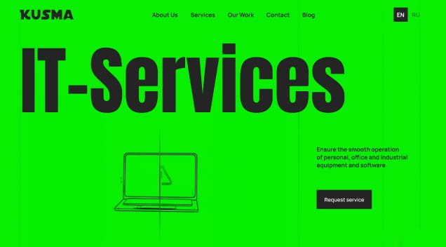
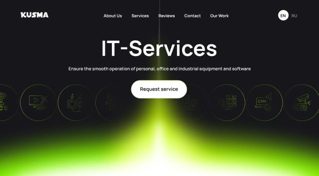
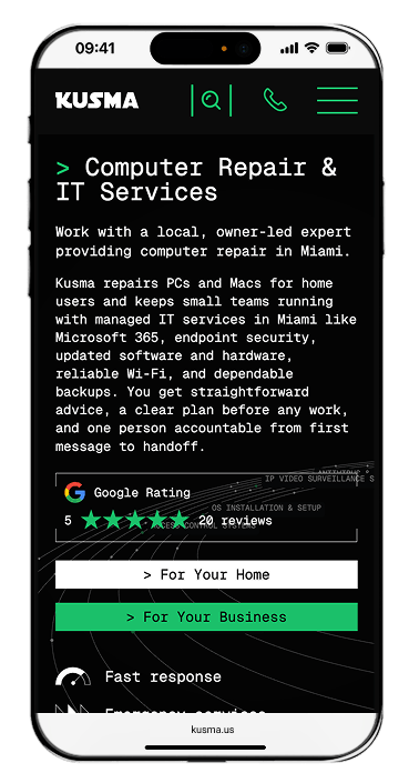
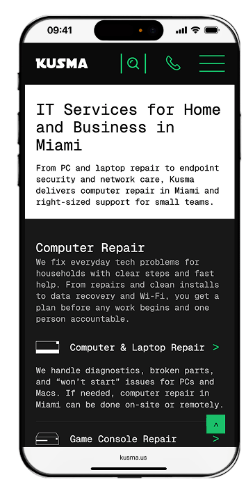
Kusma serves two very different audiences, so one of the most important changes was making that clear right away. From the first screen, visitors can choose between two simple directions: For Home and For Business. This helps people quickly understand where to go instead of sorting through services that may not apply to them.
That logic continues throughout the website. Each audience sees content, service pages, and messaging that feels more relevant to their needs.

The result
Instead of a website that feels like it is "about everything at once," the site now has a clear entry logic and consistent content separation that helps every visitor feel like the right place to be — from the first click to the last.
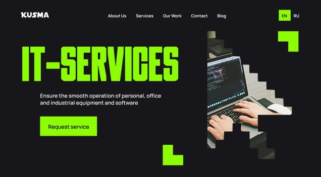
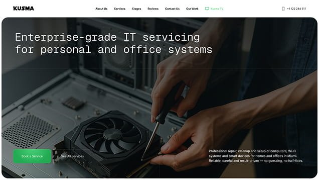
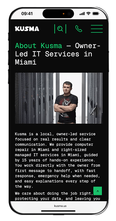
 A design built for trust, not just aesthetics
Because Kusma is a local owner-led business, the website needed to feel professional, clear, and reliable from the first impression.
We redesigned the visual style to make the site cleaner, easier to navigate, and more comfortable to use on any device. Clearer structure, simpler content blocks, and refined interaction details all help the experience feel more modern and more polished.
 Concepts
We explored multiple visual directions to balance “art” and “clarity”, tested hierarchy and readability on mobile, and aligned the final style with search and conversion goals.
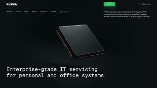
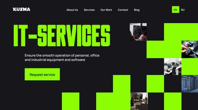
The result
A website that feels modern, credible, and more aligned with the level of service the business provides.
Microinteractions that support the experience
Subtle motion and interaction details were also added throughout the site to make the experience feel smoother and more polished without distracting from the content.
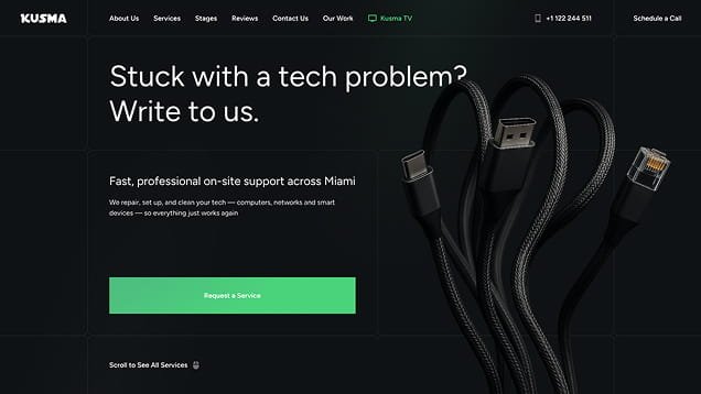
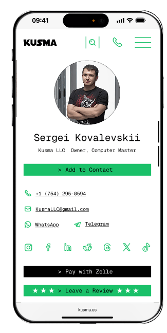
 Faster contact, less friction
We redesigned the contact experience to make reaching out as easy as possible.
Instead of relying on a single contact form, the website gives visitors several fast ways to take the next step: call, send a message, schedule a call, use WhatsApp or Telegram, or submit a request through the form. If needed, they can also attach a photo to explain the issue more clearly.
We also created a QR / web-vCard page, so users can call, save the contact, open the location, or get in touch in one tap.
The result
7+ ways to get in touch, built for real situations — not just a contact form buried at the bottom of the page
 A system the business can grow with, not just a set of pages
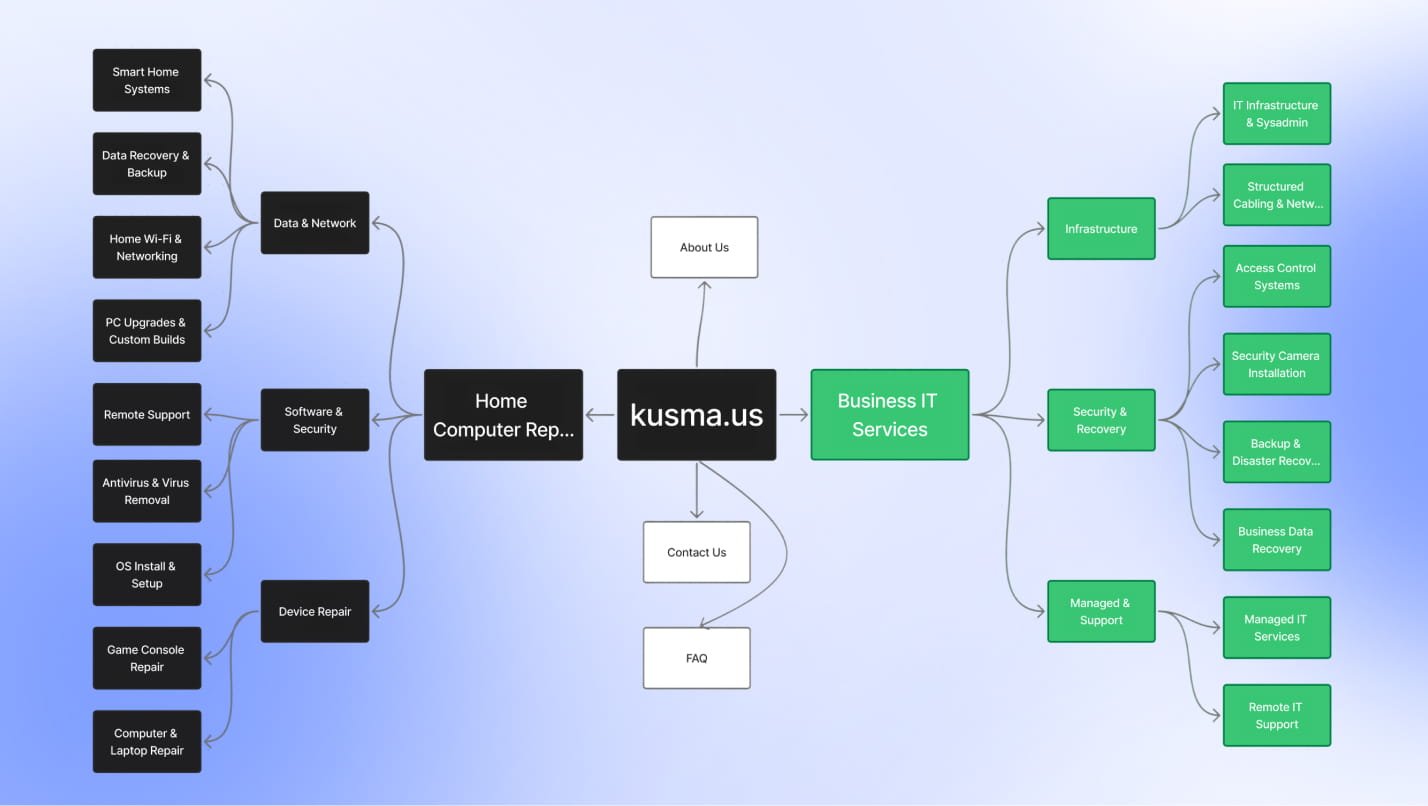
We did not build only a homepage and a few service pages. We built a complete page and template system.
The project included key commercial pages, blog, article, author, contact, FAQ, case studies, case page, 404, privacy policy, terms, and separate templates for B2B and B2C directions. The website can now grow further without turning messy or requiring the structure to be rebuilt.
The result
15+ pages across the full site structure — ready to scale without rebuilding from scratch
 SEO and performance built into the foundation
SEO was not treated as a final checklist after launch. We built it into the website from the start, so the structure, content, and technical setup all support visibility, usability, and future growth.
This means the site is not only easier for visitors to use — it is also easier for search engines to understand, index, and trust as a strong local business website.
 Built to be understood
The website was structured so both visitors and search engines can quickly understand what Kusma offers, who it serves, and how the pages relate to one another.
 Built to be found
Service pages, headings, metadata, and internal linking were planned from the beginning to support search visibility and give the business a stronger foundation for organic traffic over time.
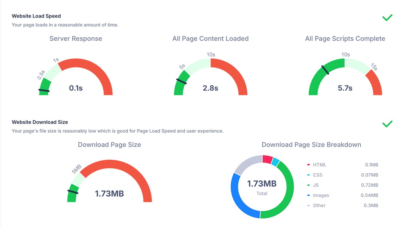
 Built to load fast
Performance was treated as part of the experience, not a technical afterthought. A faster website improves usability, supports search performance, and helps reduce drop-off once visitors arrive.

The result
A website that is clearer for users, stronger for search, and better prepared for long-term promotion from day one
 Easy to manage after launch
We designed the admin side of the website to be just as practical as the front end.
Pages, services, and blog content can be updated without technical knowledge, and the content fields are structured to be clear and easy to use. This allows the client to make day-to-day changes confidently without relying on a developer for every update.

The result
A website the team can maintain, expand, and keep active on their own
The Results
Fast loading speed across the site
s
Fast ways to contact the business
0+
Two clear entry paths for two different audiences
0x
On-site SEO foundation
Clean structure, optimized content, internal linking, and schema markup built in from day one for future growth.
Scalable site structure
15+ pages across services, FAQ, contact, blog, legal, and case studies — all managed through an independent CMS the client can update without developer support.
Success Stories You Can Trust
+0%
organic traffic
30% → 0%
organic share
0%
click-to-lead CR
16× Organic Traffic Surge for a Chicago Hardwood Contractor
A full redesign, local-SEO overhaul, and content refresh took Big Bro Hardwood from penalty-ridden obscurity to page-one dominance in just seven months.
See case study
×5
organic traffic
0%
keywords in Top-10
×0%
search visibility
ZenOne — 9× Search Visibility in 3 Months
A full redesign, clean WordPress rebuild, and AI-friendly structure made the product clear and the path to ‘Book a demo’ effortless, while an intent-focused SEO strategy amplified visibility and smart nurture kept conversations moving.
See case study
0%
organic traffic
0%
GBP profile views
×0%
GBP search views
unarthodox —60% of ticket sales from Organic
Organic search became a primary sales channel. High-intent visibility in NYC and Miami now drives consistent ticket sales.
See case study
SEO architecture for people and AI
Custom Shopify, no developer needed
Growth across every channel
Adult, SEO-First Shopify Store for Evolution Zone
We designed a US-market store to be found and to sell: clear paths to products, content that can surface in AI answers, and a custom theme your team can edit in the Shopify editor — no developer needed.
See case study
under 60 SEC
to evaluate the service
0 CLICKS
to key pages
15+
structured pages
Full digital launch for a dental radiology service
A complete digital presence for Insight Dental Radiology — including the website, report pages, and aligned launch-ready brand touchpoints.
See case study
0 weeks
Full launch
0+
Search pages
0
Lead channels
From word-of-mouth only to a working online lead system in 8 weeks
Website, SEO, ads, and Google Maps — built from scratch into a system that brings in real truck repair inquiries.
See case study